The exhibition
A multi-layered dynamic visual landscape
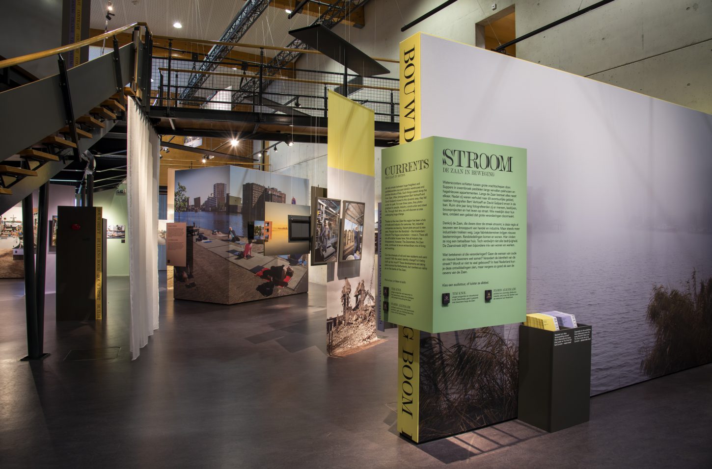
The Zaans Museum came to us with a clear wish: this photography exhibition should breathe a totally different atmosphere from the rest of the museum. With the words ‘fresh’, ‘surprising’, and ‘colorful’ in mind, Mayra and Rene worked on a design in which photography takes center stage.
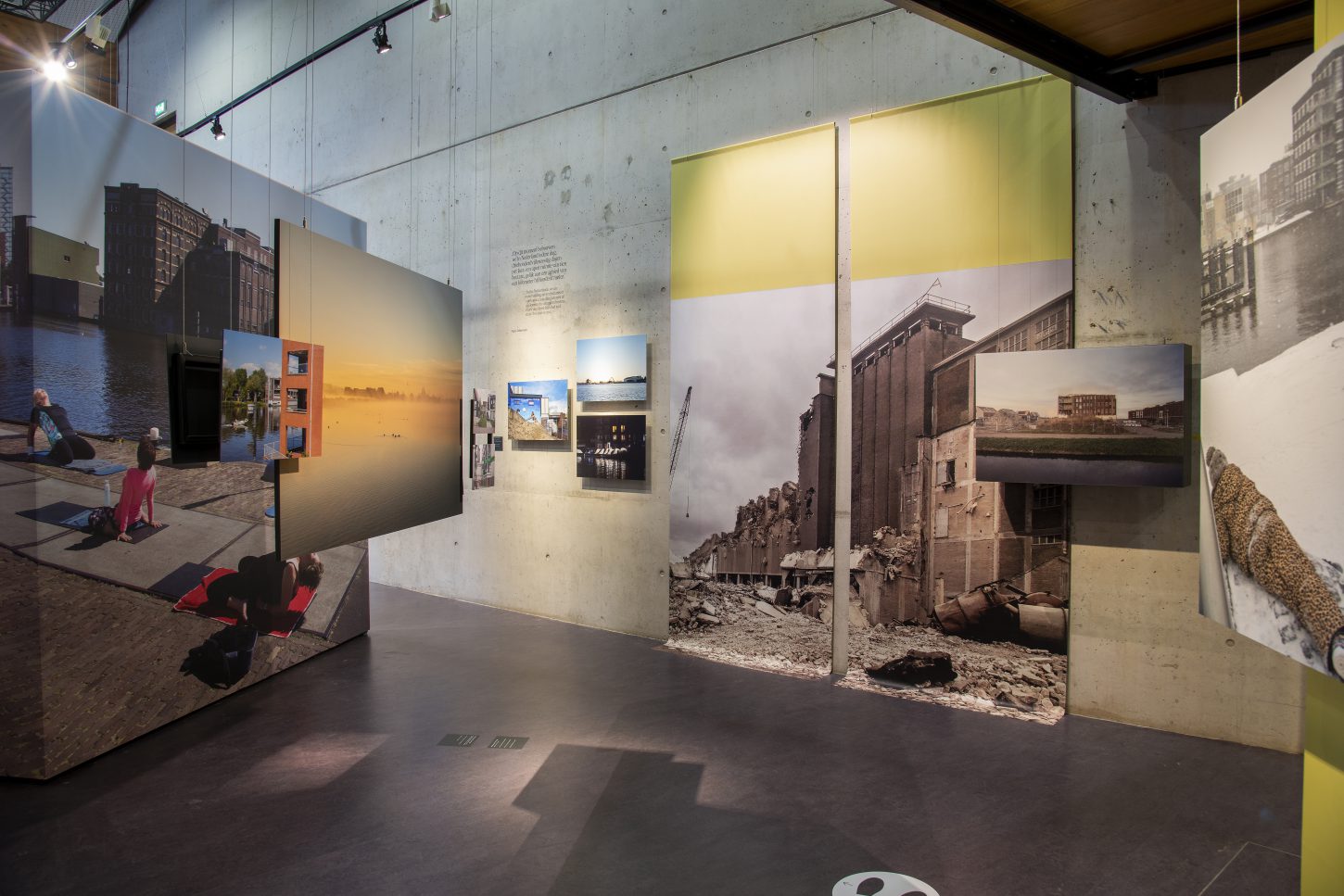
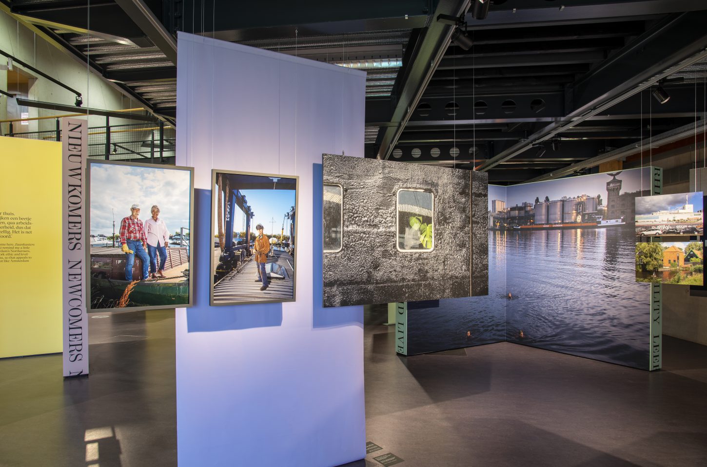
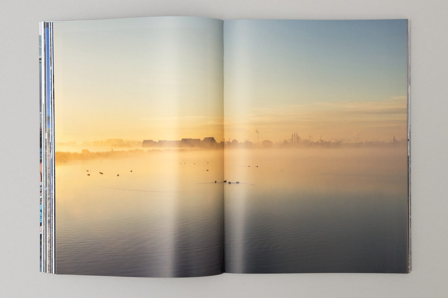
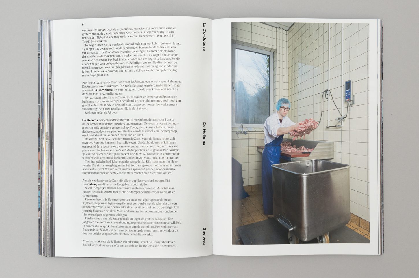
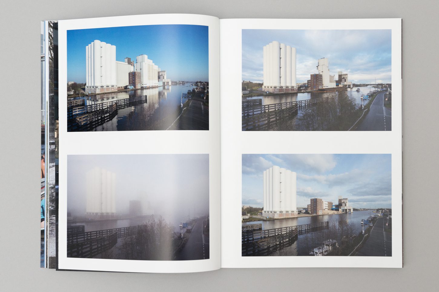
The photographic work consists of a combination of street photography, lenticular series, and portraits. Each of the three is given its own medium and format in the exhibition to underline the layering. To bring air into the design, we make maximum use of the hall’s height. Almost all the photos hang in clusters from the high ceiling, creating vistas and sightlines that create exciting visual connections between the images.
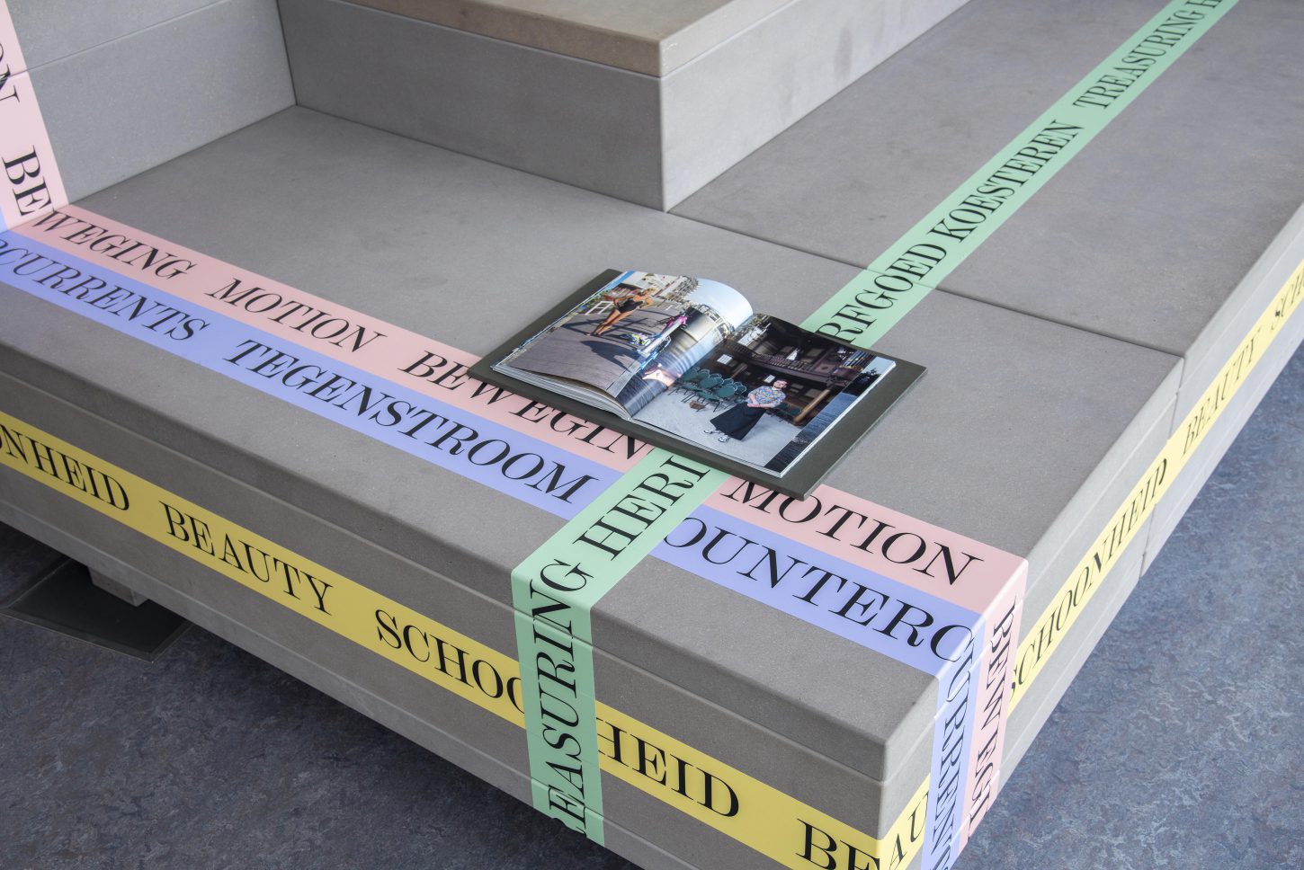
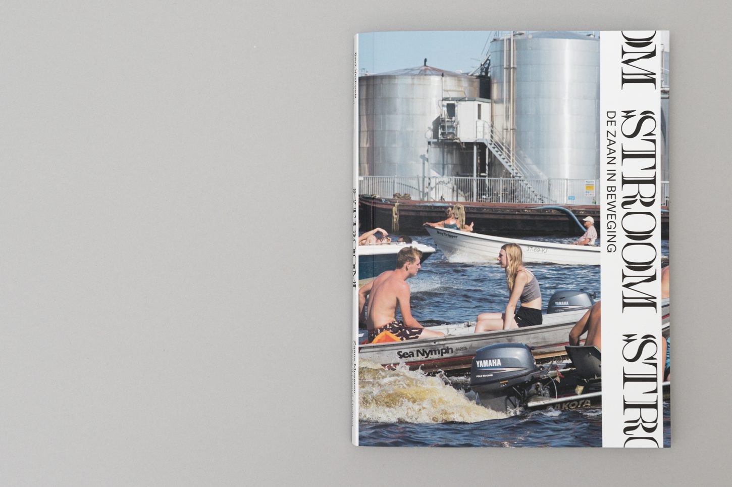
The graphic identity of the exhibition clearly reflects the transition that is happening in the Zaan region. We translated the changes so strongly present in Bert and David’s work into a recognizable exhibition logo that connects the exhibition, campaign, and publication. Combined with four fresh colors that form a strong contrast to the dark green that typifies the Zaanstreek, the result is an exhibition with a surprising face that portrays the changes in the region in a dynamic, layered way.
